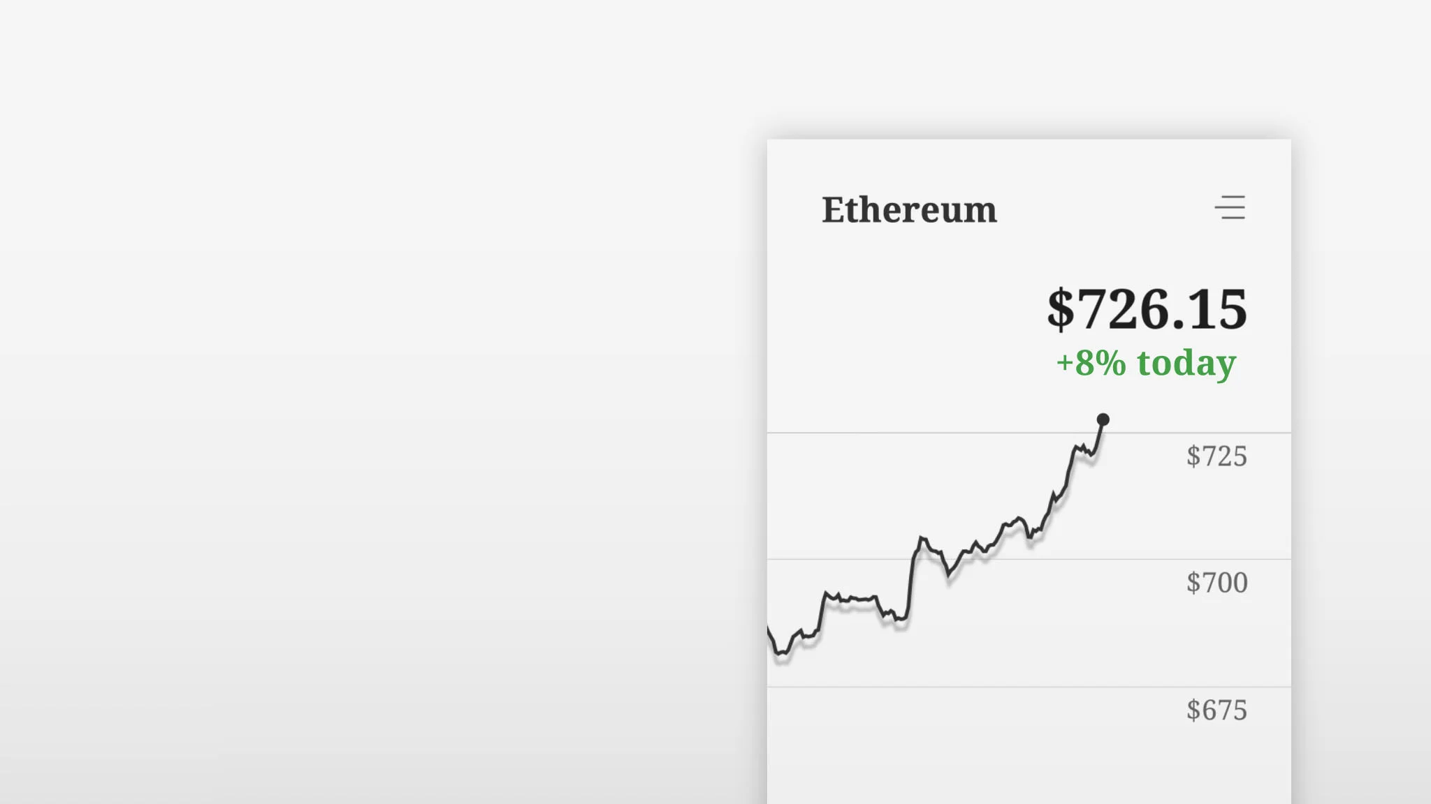
We sometimes hear reports about the rise of luxury goods, but we haven’t seen much of it in digital products. Maybe people don’t know what digital luxury is or how it can manifest itself? If a Bitcoin millionaire would want to show off an extravagant crypto wallet, what would it look like? Possibly something like this:
Luxury is created by design and by scarcity. For physical products, this typically means limited edition items made from expensive materials. A watch doesn’t need gold to be functional. What type of materials can we waste to add a sense of luxury to digital products?
Waste screen space. High-end print items use excessive white space to add richness and importance to page content. In a similar way, designers can waste pixels in digital layouts and use more empty space than needed. The old “less is more” design pattern applies to digital products too.
Waste time. We expect quality to take time. For example, when being served a meal at a high-end restaurant, a calm and elaborate service is part of a luxurious experience. Digital designers spend a lot of time crafting software, but few consider actually slowing down parts of the user interface. Wasting time in selected transitions can be a way to boost a specific user experience. For example, when a player is about to win a game of Peggle, the animation slows down to kick off an amazing and ludicrous visual celebration.
So, if you happen to know someone who wants an exclusive digital wallet for their Bitcoin billions, please get in touch! We’re available for some really, really expensive design work.


